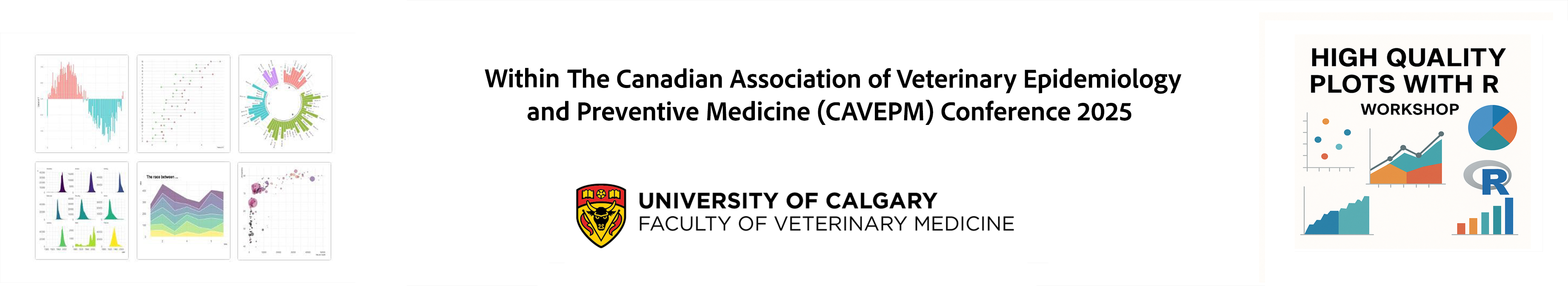
Welcome to the workshop:
Creating High Quality Scientific Figures with R
Instructor: Dr. Juan Jovel. Office of Research, UCVM.
June 11, 2025 (9:00 am - 4:00 pm) ❃ HRIC BA65 ❃ Registration fee: CAN $75.00 ♥ ♥ ♥
Registration fee includes snacks and lunch!!!
Transform your research data into compelling visual stories. Join us for a hands-on workshop where you'll learn to create publication-ready scientific figures using R's powerful visualization ecosystem.
From basic plots to complex multi-panel visualizations, discover how to effectively communicate your findings with precision and clarity. Perfect for researchers at any level looking to elevate their data presentation skills.
Workshop Schedule (9:00 AM - 4:00 PM)
Content
9:00 AM – 9:15 AM Welcome & Introduction
- Overview of the day
- Goals and expected outcomes
- Quick survey of participants' experience with R/ggplot2
9:15 AM – 10:00 AM Session 1: Getting Started with Tidyverse
- Data wrangling with dplyr and tidyr
- Preparing data for visualization
10:00 - 10:15 AM: Coffee Break
10:15 AM – 11:00 AM Session 2: Fundamentals of ggplot2
- Grammar of graphics
- Basic plots: scatter, bar, line, etc.
- Aesthetic mappings (aes())
11:00 AM – 11:55 AM Session 3: Enhancing Plots for Scientific Communication
- Facets, scales, and themes
- Saving plots for publication
12:00 - 1:00 PM: Lunch Break
1:00 PM – 1:45 PM Session 4: Visualizing Complex Data
- Heatmaps
- Multi-panel figures
- Plotting statistical summaries
- Adding error bars, confidence intervals
1:45 PM – 2:30 PM Session 5: Color Palettes and Accessibility
- Choosing effective and colorblind-friendly palettes
- scale_color_brewer(), viridis, etc.
- Creating custom color palettes
2:30 - 2:45 PM: Coffee Break
2:45 PM – 3:15 PM Session 6: Creating Composite Figures and Exporting
- Combining plots with patchwork, cowplot, or ggpubr
- Export formats and resolution for publications
3:15 PM – 4:00 PM Session 7: Enhancing R Plotting with AI Tools
- Why integrate AI into your R plotting workflow?
- AI-assisted data exploration
- Generate ggplot2 template code from plain-text descriptions
- Refine existing code using AI suggestions
- Live example: regenerate a script with AI and interpret the output
- Key takeaway: use AI as an assistant, not a replacement
Intended audience
Perfect for: Graduate students, postdocs, research staff, and faculty who want to elevate
their scientific figures from acceptable to exceptional.
Created by Juan Jovel, no right reseved.